It’s White Balance on Steroids
By Tanya Riseman, March 2024
Lightroom’s Color Grading panel is sadly neglected. It complements but does in any way not duplicate the Color Mixing panel and White Balance. It can be used to produce monochrome, sepia, duotones and even trio-tones from grayscale images. It has three color wheels (with saturation and luminosity to boot) for the shadows, midtones, and highlight portions of the image. In color images, it casts a color for each of those regions, kind of like a souped-up White Balance for each! Cinema often uses color grading to produce a coherent color scheme for each the movie, evoking a particular mood. So it is certainly a great technique that photographers can use to expand their repertoire. For comparison’s sake, we discuss white balance as a preface.
For an introduction as to how to use the interface, see Julieanne Kost’s video https://jkost.com/blog/2020/10/lightroom-classic-v10.html. You can type in values or use sliders as well as rotate the solid dots and open circles on the color wheel.
Preface: White Balance
Hopefully, you are familiar with white balance, If not, here is a lightening speed introduction.
The sun’s light is actually different colors during the day – orange to deep blue. Incandescent (tungsten), florescent, and flash lights are different too. A standard way of keeping track of the color is its black body temperature in degrees Kelvin but just think of it as an arbitrary scale for simplicity.
Different Color Temperatures of Lighting (Approximate)
- 1850 K Candle flame, sunset/sunrise (orange)
- 2400 K Standard incandescent lamps (yellow)
- 2700 K “Soft white” compact fluorescent and LED lamps
- 3000 K Warm white compact fluorescent and LED lamps
- 5000 K Horizon daylight
- 5750 K Vertical daylight, electronic flash (white)
- 6500 K Daylight, overcast
- 7500 K Shade (blue)
- 8000 K LCD screen
en.wikipedia.org/wiki/Color_temperature
White balance cancels out the color cast produced by the illuminating light, so the whites look the “right” color white. (Your eyes/brain do the same thing.) It is described primarily by temperature (yellow to blue) and a twiddle factor called tint (green to magenta).
Raw files from your camera typically have a list of pre-fabricated white balance choices. The following picture was taken with a Nikon D90 and has pre-fabricated white balances of
- as shot
- auto
- daylight
- cloudy
- shade
- tungsten
- florescent
- flash
You can select anyone of them in Lightroom regardless of what you set the camera to. I usually prefer to use Daylight in camera so sunsets come out colorful and the lighting reflects the time of day. Other people prefer auto so that documentary photos of things come out “the right color”.
Too bad if you shoot in JPG or HEIC (Apple) – the set white balance is permanent, other than making a custom adjustment.
You can always create a custom white balance in one of two ways:
- Adjust the Temp and Tint sliders. I find this difficult, other than as a minor adjustment.
- Grab the eye dropper and click on a neutral area of your picture that you expect to be gray or nearly white.
If you go nuts with the Temp and Tint sliders, you can get a huge range of colors cast but it is not intuitive as how to select a particular hue. But it is not intended to be a creative adjustment.
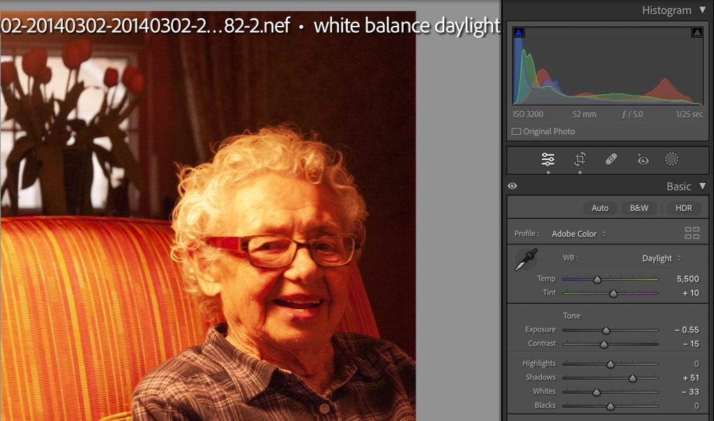
This was taken on a cloudy day and my choice of Daylight white balance (5500 K) kind of gets the tulip flowers red and the window too pink to be a neutral color. But my model is completely orange-yellow due to the incandescent lighting by her. Not successful.
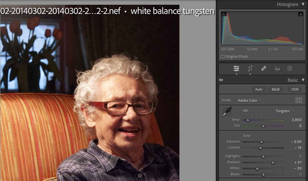
Here, I have selected the Tungsten white balance (2850 K) and now the window and flowers are really blue. My model is looking pretty reasonable but a little adjusting of the Temp and Tint sliders might improve her skin tone.
Below, I’ve added a grayscale test card, so you can see more clearly what’s happening. Because it is a JPG file, only a custom white balance is available. Here, I used the eye-dropper to select an area in her white hair, which sets the white point (in arbitrary units for temperature and tint).
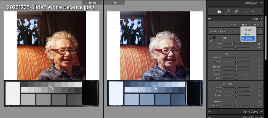
If needed, I recommend that you set the White Balance once before you go into the Color Grading panel and don’t touch it again. Particularly, avoid adjusting the White Balance, the Global color wheel, and/or the Midtones color wheel at the same time, because if you use some or all at the same time, you will get very confused.
Color Grading
The color grading module has four color wheels, with which you can adjust the hue, saturation, and luminosity. Three of them are for adjusting the color cast for the shadows, midtones, and highlights portions of the tones. The global one affects all tones equally, sort of like the white balance, except with additional control over the saturation and luminosity, If you chose zero saturation (the default), there is no change in color for that tonal range.
Color Grading from Grayscale Images
Monochrome from Grayscale
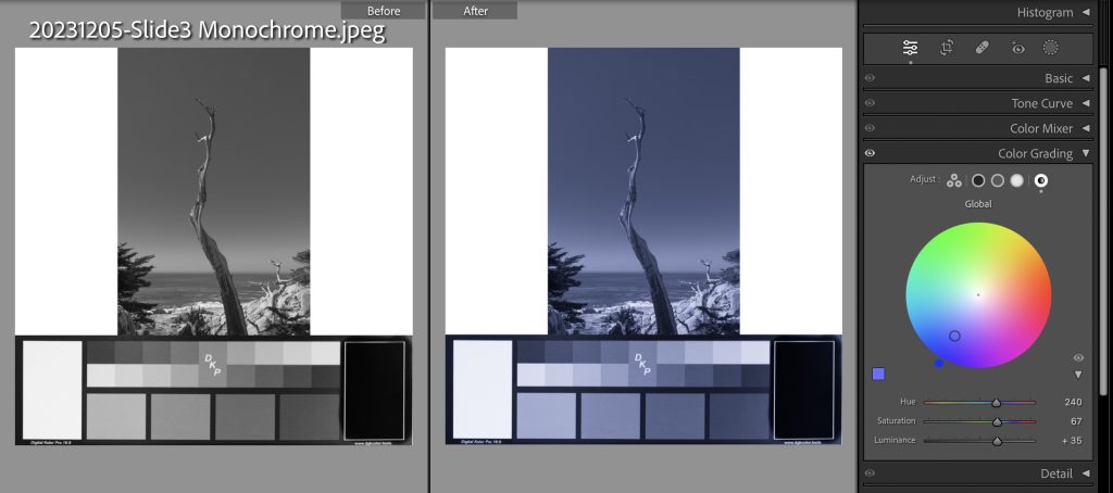
In addition to the three color wheels for shadows, midtones and highlights, there is a global color wheel. It puts a extra uniform color cast to the whole picture. To create a monochrome image, use only the global wheel on a grayscale image. Here, I chose a blue (hue 240) with a saturation of 67%. The saturation is also indicated by the open ring that is half way between the solid blue circle on the outside of the wheel (fully saturated) and the center dot (no saturation). The luminance (brightness) slider has been increased a bit to +35, but we could have used the exposure slider in the Basic panel instead.
Note: This is the only case where I use the global color wheel. It could be a final tweak for other cases, but I recommend against it for simplicity’s sake.
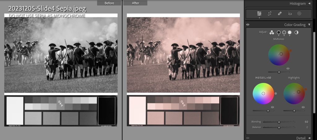
Sepia from Grayscale (Is it a monochrome?)
True sepia is a photographic process that uses metallic silver which is converted to silver sulfide. Physical sepia pictures can have shiny portions in the dark areas (tarnished silver metal), so perhaps it is not quite a monochrome. In practice, you can find a lot of great sepia presets, but who knows how many colors the creators used. Here, I have used pure gray for the shadows (no saturation) and orange for both the midtones and highlights, at saturations of 25% and 50%. The luminosity of the shadows has been increased to +50 (which we could have done using the Basic panel instead). This is not a monchrome because I used gray – the darkest colors are increasingly bluer than the orange hue. In general, DO NOT USE SEPIA IN MONOCHROME COMPETITIONS.
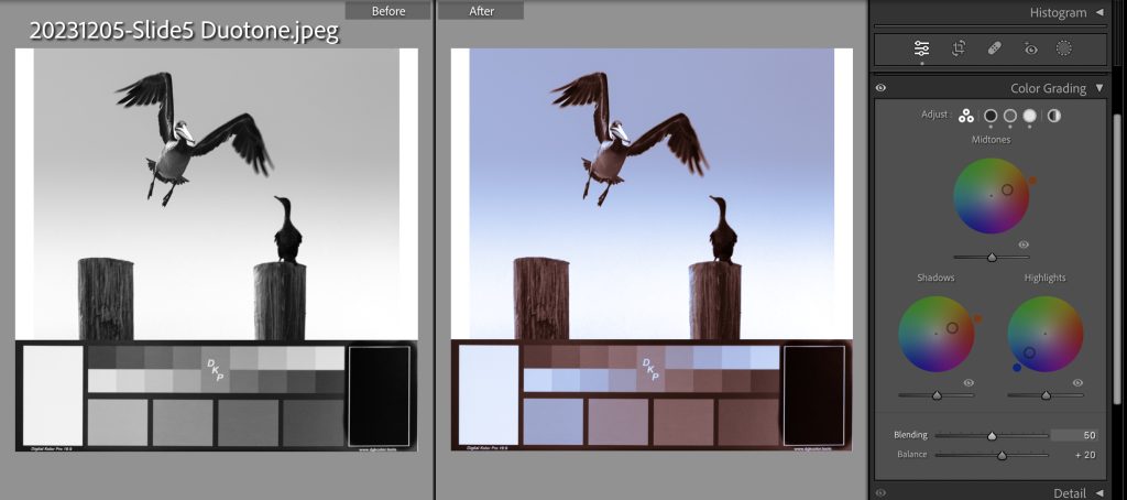
Duotone from Grayscale
Duotone is using two different colors in the shadows and and the highlights. Here I’ve chosen blue for the highlights to represent the sky and orange-brown for the shadows to represent the birds and the posts. The midtones is also the same orange, just going along for the ride. We don’t want it to be a pure gray because that would add additional colors. Note that I have increased the Balance slider, so there is more emphasis on the blue highlights.
Color Grading from Color Images
To prepare, do your basic edits in the Basic panel, including setting the white balance. For most of the following examples, I will not use the midtones color wheel as well as changing the white balance, because they kind of both have the same effect and it is confusing.
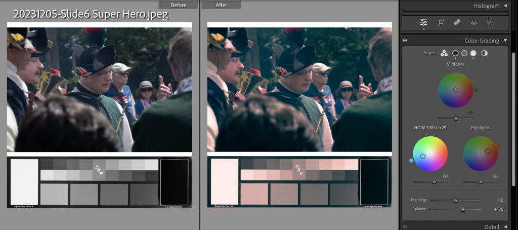
Color Grading for a Super Hero Look
I have selected the complementary colors of teal and orange for the shadows and highlights. This gives the resulting image more color contrast, a bit of color zing. I have increased the shadow luminosity to +25 exposure, so that the teal cast shows up better, (I could have increased the Black or Shadows sliders in the Basic panel instead.) The balance slider has been increased to +40 to empathize the orangy highlights. This color grading is popular in cinematography.
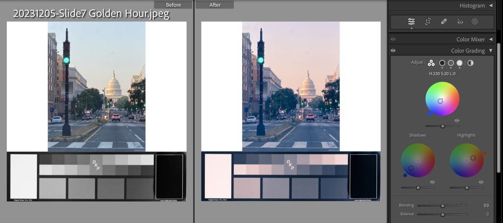
Enhancing the Golden Hour look
Here, I’ve chosen blue for the shadows color wheel, since natural shade is very blue. The highlights are cast orange, to simulate the warm light of dawn.
Creative Use of the Midtones Color Wheel
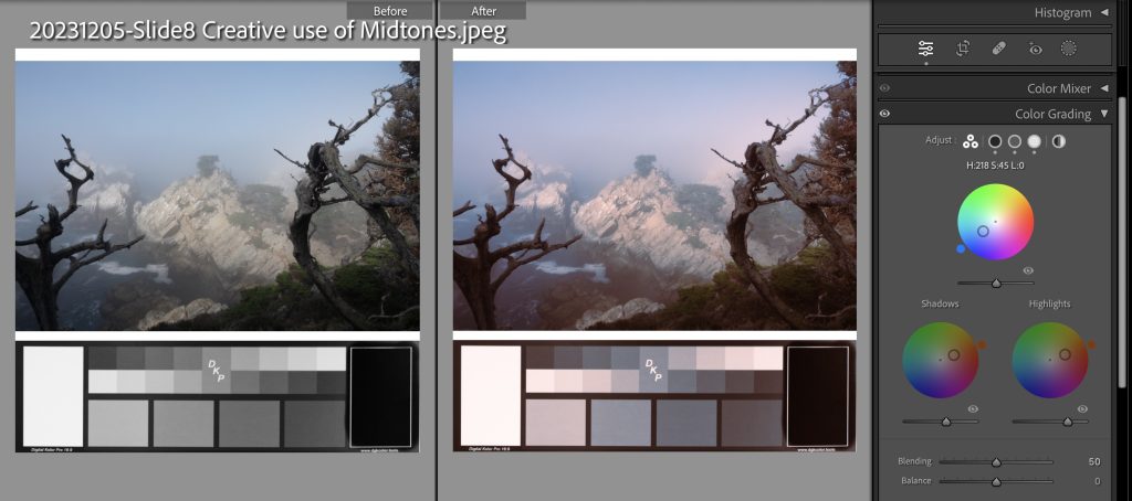
Here, I chose to warm up both the dark dead trees and the bright rock face by using orange in the shadows and highlights. They leak into to the midtones, which is predominately blue sky. So I added back the blue color with the midtones color wheel. This is definitely a special case.
When to Use Color Grading instead of Color Mixing
Color grading puts a color cast on one range of tones at a time. It is a little like a white balance for just one of the the shadows, midtones, or highlights ranges. You cannot use color grading with masks.
Color mixing changes one color at a time, for the whole image, for all tones – shadows to highlights. That is you can change the brightness, saturation and, to a certain extent, the hue of one color, like blue for creating a dramatic sky. You cannot use color mixing with masks.
Hint: Color Mixing is useless with Grays and Blown-out Skies
If I have a bit of blown out bokeh or sky, I usually futilely try to darken it with a mask brush and then increase the saturation or try to heal it, If I have a gray area that I want to make more colorful, the closer to pure gray or white, the more futile these methods are., All I get is gray. I might even get halos if I am too extreme. The Color Mixing and Color Grading modules offer alternative ways to fix things up, which might be helpful depending on the situation.
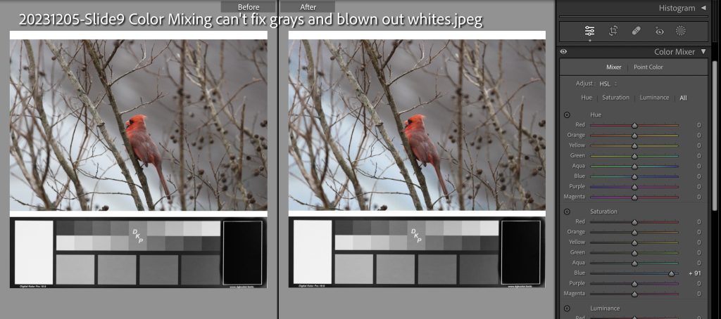
Say that I have a photo of a bird in a tree, with the sky either depressingly overcast or just blown-out white from the camera’s limited dynamic range.
To jazz up the white area (sky? snow?), I can try to boost the saturation of the blue in the Color Mixer panel. In this case, it sort of works, but I had to max out the saturation. The medium gray on the right side of the picture is problematic. The red, orange, and magenta saturation sliders make a tiny difference. However the red and orange sliders interfere with the color of the cardinal. So here I only adjusted the highlight tones for blue.
Color Grading Livens up Gray Areas
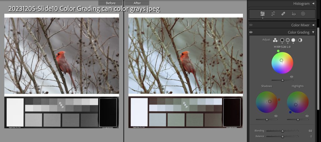
You can color light, medium and dark grays anyway you want with Color Grading panel. Here, I’ve made the whites bluer without having to max-out any sliders. I’ve made the middle gray on the right green, as if whatever-it-was is foliage. The cardinal gets a bit dingy due to the green leaking in from the midtones, so I added some red to the shadows color wheel.
Finale
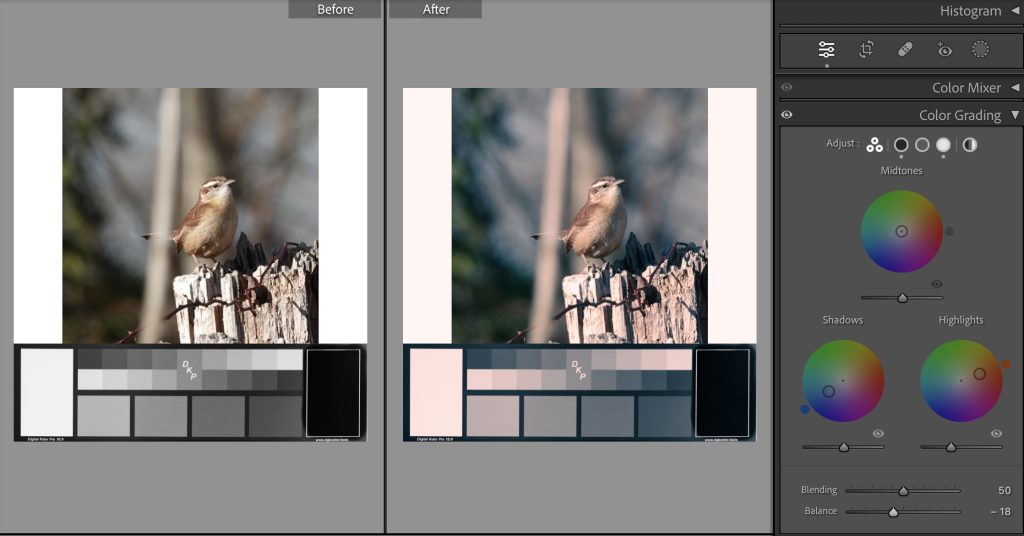
I am still finding my way with using color grading on color images. This one, of a Carolina Wren, I think is pretty good.
Final words
If you found this presentation a bit difficult, the one piece that will have the greatest impact upon your photography is the concept of White Balance. So research that more and practice it. The use of the global color wheel is very handy for converting grayscale images to colorful monochromes and that is relatively easy. Perfect for Monochrome competitions.
I hope this blog post encourages you to try out the Color Grading panel in Lightroom and have more control editing the colors in your images.
