
Have you ever noticed that images you submitted to our club’s projected-image competitions were off color, or maybe your winning image that was published in the Cable Release looked muddy and muted? This has happened several times in the past, and the cause could be attributed to many factors. It could have been caused by the club’s projector, or an uncalibrated computer monitor, or even the color space you used. We won’t get into whether the projector or an uncalibrated computer monitor was the cause at this time and leave it for a future discussion…maybe. So, that leaves “color space.” What? You don’t know what “color space” is? Don’t worry, most people don’t. And, it likely doesn’t affect you. But, using a particular color space can have the most noticeable effect and cause images to be way off-color as you can see in the upper-right image.
Simply stated, “color space” is a specific organization of colors. I know that doesn’t explain much, but getting into any more detail only get worse, and it isn’t necessary to know what color space is. It’s only necessary to know that using a color space that is not supported by a particular software application can cause your image to look way off-color – muddy and muted. Although there are several color spaces, the one most people have heard of is the RGB (red, green, blue) color space. Actually, RGB is not a color space, but rather a color model. There are several RGB color spaces under the RGB color model. The most common ones used by photographers are sRGB, Adobe RGB, Display P3 and ProPhoto RGB. Unless you are using Adobe Lightroom or Photoshop, your images are most likely using the sRGB color space, the standard color space of the web. In that case, you can probably skip the rest of this article. You’re safe!
But, for those of you using Adobe Lightroom (LR) or Photoshop (PS), you may not even know what color space your images are in because when you first started using LR or PS, you might have unknowingly selected a particular color space (e.g., ProPhoto RGB) or let Adobe select a color space as your default color space without knowing what it is or what it does. In fact, Adobe recommends using the ProPhoto RGB color space when editing in Photoshop because it has a wider set of colors (also referred to as “gamut”). And, using the ProPhoto RGB color space would appear fine and not show any off-colors in your image as long as you are working in LR or PS. But, the off-colors might show up later, unbeknownst to you, after you submit your image to the projected-image competition, the Cable Release, or in an email – depending on how your email system handles the ProPhoto RGB color space.
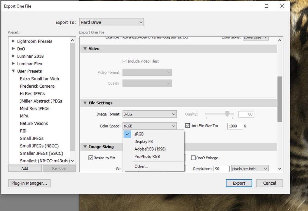
We have discovered that if you send a ProPhoto image through the email or if your image is brought into a non-Adobe software application that doesn’t recognize the ProPhoto color space (e.g., Irfanview), the colors might change significantly. So, how do you know what color space your images are in, and how can you avoid this issue altogether? Fortunately, the answer is quite simple. When you export your image in Lightroom to the proper SSCC format, there is an option under File Settings that lets you choose your color space. See image below.

Select sRGB in the Color Space dialog box. Do not select ProPhoto RGB.
It is important to note that we are not suggesting that you not use ProPhoto RGB color space when editing in Photoshop. Just be sure to convert the image to sRGB when exporting the image in Lightroom. By making this simple change, we can eliminate one cause of off-colors in our images that are projected during competitions or published in the Cable Release.

This is helpful. At another time can you give suggestions as to how to make the printed version equal the computer version of an image. I’ve noticed that my prints do not match the colors on my monitor.