Squarespace has dozens of web site templates, covering personal, photography, art, business and e-commerce. What is very nice is that they are all designed to be “responsive”, i.e. automatically resizing and reshaping for computers, iPads and smartphones and also the font size you chose in your browser.
I selected the Wells template in the photography category, shown below. Note the rectangular-ish icons in the upper lefthand side; you can change the preview between computer, iPads and smartphones. Shown is the top page for a gallery, with thumbnail images responsively arranged in columns for computers and in a single column for iPads and smartphones. Thumbnail images in Squarespace are amazingly large, sometimes bigger than the main images. A blog is automatically included with this template.
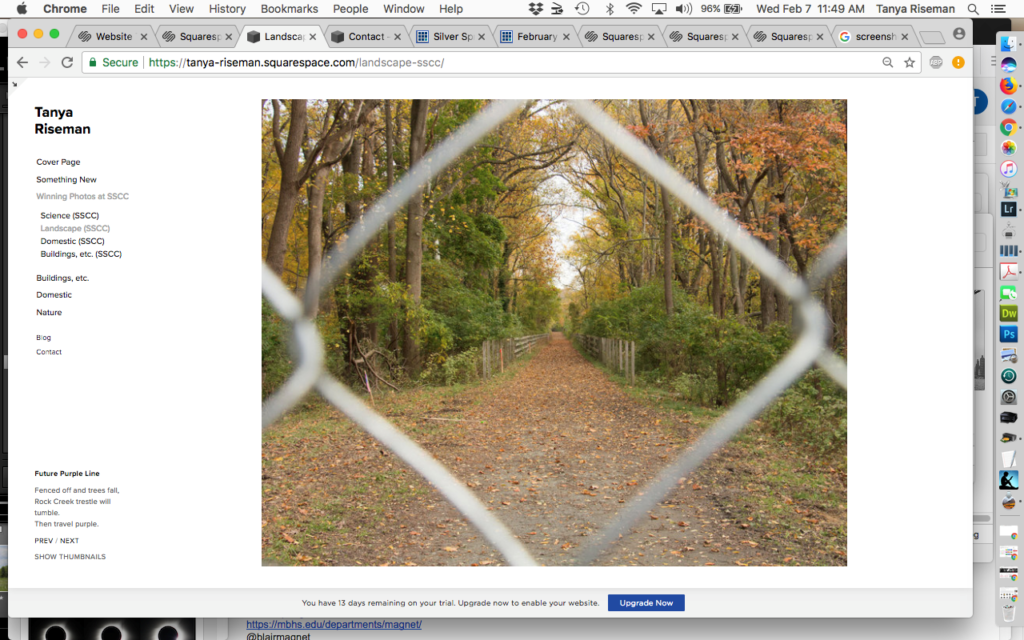
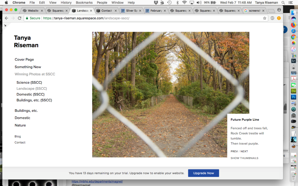
When you click down on a single image, it looks like one or the other of the following screenshots, with the title and caption below the navigation column only if there is room. Responsive design again.
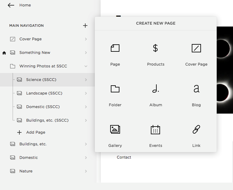
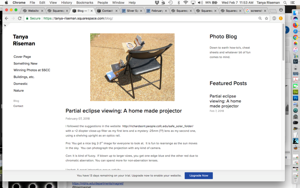
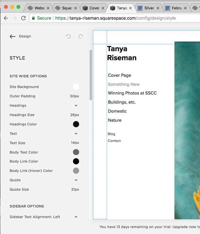
What’s it like to make a web site? When you download a template, it’s filled with photos and Latin gibberish. You just click on “+” to select and add a gallery and somehow magically your stuff appears instead of the template’s filler. I was able to create my photo galleries by hovering and clicking on icons, “EDIT”, etc., without reading any advice or watching videos. I did have to revert to reading for a problem with my blog and the not obvious method of moving items between pages/galleries. The help is easy to read. Here’s what it looks like to add a new page, which could be a gallery, a blog, an events calendar, or make up what you want. I kept my website pretty simple, but you can do stuff like embedded multiple columns, hide a page, install e-commerce page(s) and even add scripting code.
Itch to be more creative? You can switch templates without commitment. I haven’t tried it. Write a blog. You can change lots of HTML/CSS settings, etc., but you risk ruining the design that a professional graphic designer made.
If I want to sell commercial prints, photo key chains and other photo trinkets via a contracted manufacturing company, I might consider SmugMug or Zenfolio, rather than use the general e-commerce tools here. It does turn out that there is a new commerce option specialized for photography templates which does rudimentary sales of print or digital photos. You still have to make or buy the physical print and mail it. See this blog graphpaperpress.com/blog/sell-photos-using-squarespace for more detail. But who actually gets any sales from personal web sites? Someone really desperate can send me an email through the contact form.
In conclusion, Squarespace is much more powerful than I need to make a simple photography web site. One drawback to such a modern product is that it does not get along with my adblockers. That being said, Squarespace seems much easier than I expected with a nice result across platforms, due to its responsive layout.
Here is the new website: tanya-riseman.squarespace.com


