LET’S GET STARTED
by David W. Powell
___________________________________________________________________
Lightroom Classic Post-Crop Vignetting
From the American Heritage College Dictionary:
vignetting tr.v. 1. To soften the edges of a picture to fade gradually into the background.
Photo-speak and English don’t always line up… in this case they do.
Back in the day, when we made prints with enlargers and chemicals, darkening the edges a little was standard practice for fine print makers. Today we have the Post-Crop Vignetting tool in Lr to make the effect simple, very malleable, and NONDESTRUCTIVE.
In the development module, Effects Post-Crop Vignetting panel, the Amount and Feather sliders are the two I use most often. Using these together one can produce subtle to dramatic effects. If you change your mind on the crop the effect follows the new crop (that’s the post-crop part). If you hate it, you can pull it back or start over (that’s the nondestructive part), unlike the throw-out-the-test-print days. My trash cans used to fill up quickly.
Moving the Amount slider to left (-) darkens the edges and to the right (+) lightens them.
The Feather slider softens the effect as you move it to the right.
For a first look you might try:
Amount -25
Midpoint 50
Roundness 0
Feather 60
Highlights 0
and work from there.
Play around and have fun. You might try positive vignetting as well… I don’t think it works very often. I tend to overdo things at first, then after living with it awhile, go back and soften things up a fair amount. The other two sliders, Midpoint and Roundness, change the shape of the vignette. I don’t use these often. But I do go back and use the Adjustment Brush (K) and Graduated Filter (M) for alterations and touch-ups… more about that and those tools at a later date.
Give it a try if you haven’t and let me know what you think.
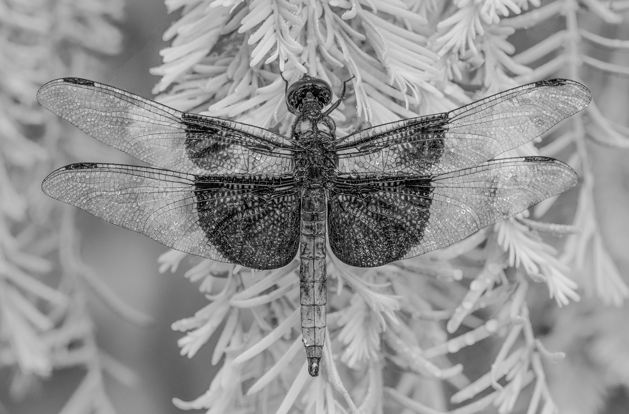
Pic #5: B&W conversion through a green filter to lighten the foliage: default settings 0; 50; 0; 50; 0
I surprised myself. I think I like the green filtered, positive vignetted, B&W #7 and the more extreme vignetted best… you don’t know if you don’t try.

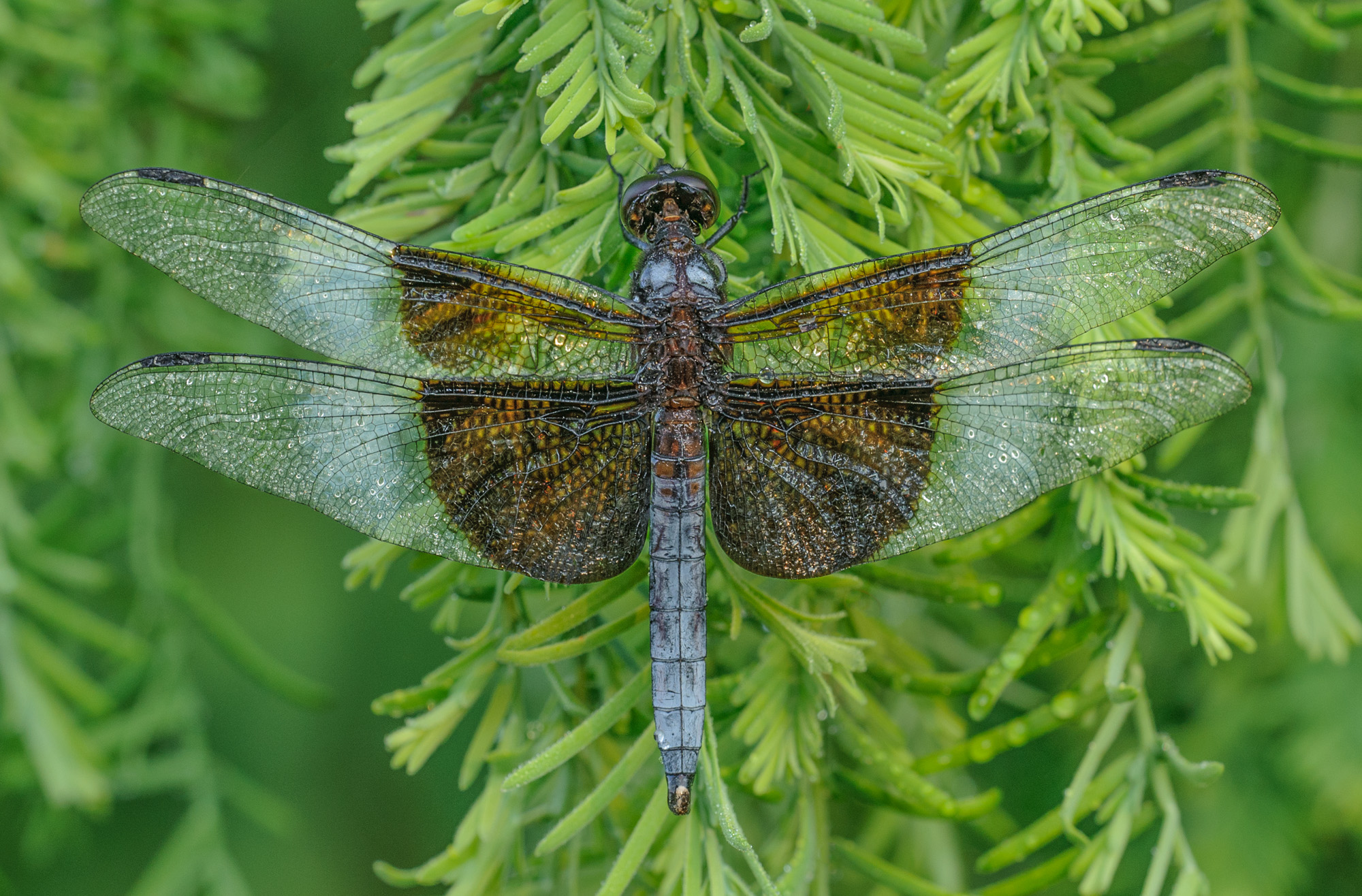
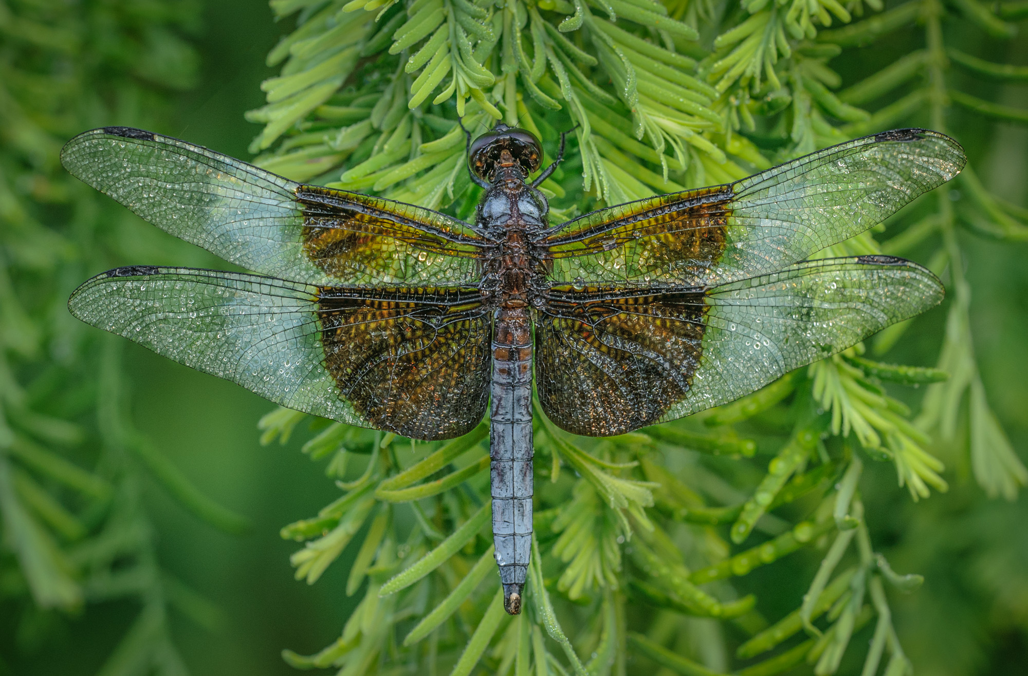
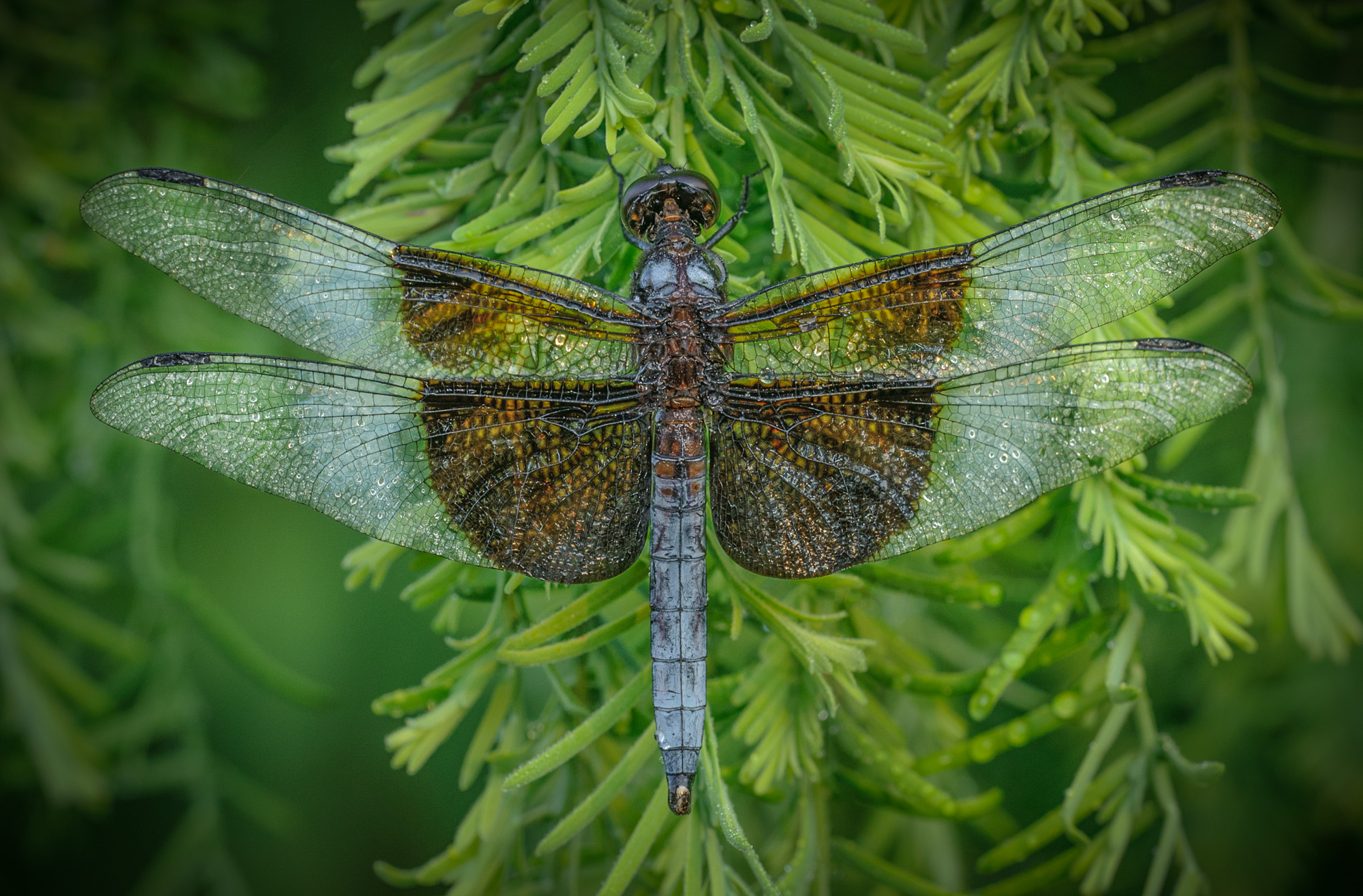
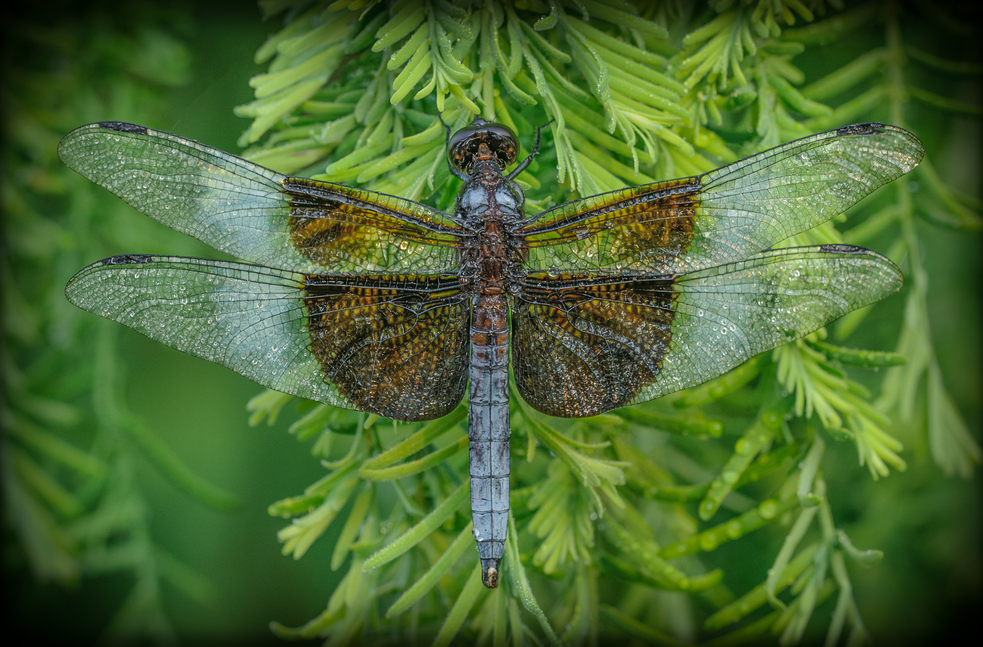
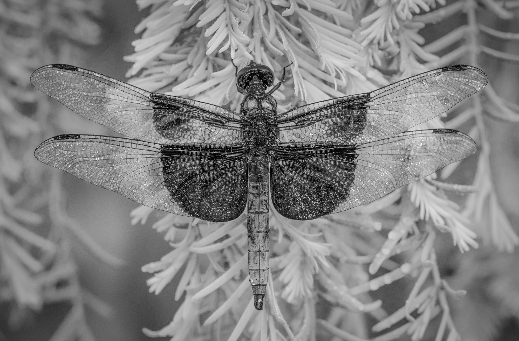
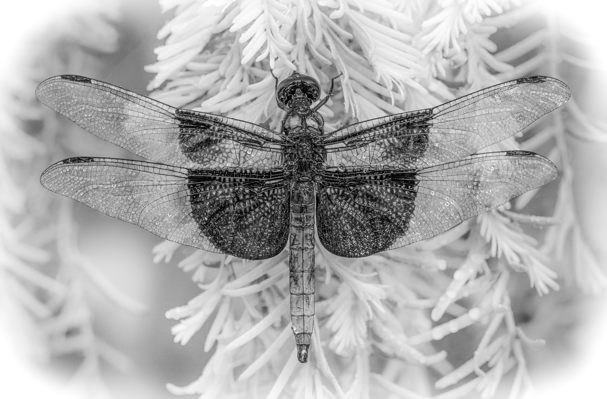
Showing the different examples, with the settings, is very helpful to me to understand how to get the effects you’re showing. I really appreciate this kind of “hands on” guidance. Thank you.