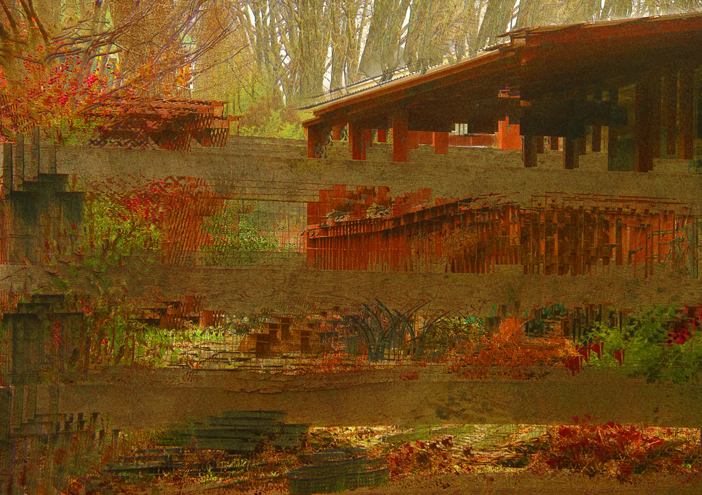
Bruce Baille passed away in early April of this year. Until I read his obituary published in the Washington Post, (thanks to Dennis Freeman for forwarding the WaPo article), I was not aware he was a 1960’s avant-garde film maker with several films that are now in the National Film Registry. Many of his films are only several minutes long and are usually abstract in nature. He considered the film editing process as “composing.” He often worked by hand-layering multiple images together. The obituary said that “Mr. Baille honed a style that combined a documentary approach with a deeply personal vision…” After reading the article I felt Baille’s way of making a film and the connection to still photography was unmistakable. I was intrigued and viewed two of his films mentioned in the obit, “Castro Street” and “All My Life.”
After viewing the two films, (about 10 minutes of my time), the connection to still photography was more apparent. First of all, I didn’t “get it” while viewing each film. However, after paying more attention to the title of each, the meaning became more concrete. Then, I “got it.” I didn’t understand the films from the filmmaker’s perspective until I had the narrative clue of the film’s title. The title guided my perception and helped me understand what Baille was saying with his film. Some would argue a film or a photograph should stand on its own visually and not need a title. In this case, with Baille’s films, the title was very important because it was integral to my understanding of the artwork. The same can be said for our photographs. The title usually says something about the image in an explanatory way that could help a viewer place the subject in context or guide a deeper understanding towards the meaning.
Here’s an example similar to my experience with the Baille films. Several years ago, I placed an image in a competition and was awarded an HM prize. When reading the title of the image to the audience the judge spoke up and said if he had known the title beforehand, he would have placed the image higher than HM. When the judge first saw my image he didn’t get it. Only after the title reveal (Whiskey Vision) did the image make sense.

Photography is a language with a visual vocabulary. But, just like all other languages, the addition of other cues such as gesture, facial expression, and intonation help to impart meaning. All artwork, whether visual, written, oral, or performance art requires other stimulus to help the viewer’s understanding. Our photography is no different. In fact, it’s a requirement of the competition rules to title the images submitted. So, if the rules require a title, because presumably the title is important to the image’s meaning, why not read the titles of all images when they’re presented to the audience? I believe this will help the audience and judge with “getting it” and could be an interesting addition to the critique.
Please leave your thoughts in the comments below.
